The thought process and design behind TANGO OPEN branding.
~A Highly-Applicable Brand Name~
The thought process and design behind TANGO OPEN branding.
Our Branding Thought Process
_A Highly-Applicable Brand Name
When one hears “Tango Chirimen”, one might think of 100% pure silk, a fine texture beloved by many, or maybe even a 30-centemeter-thick textile used in Japanese clothing. However, new fabrics born from technological innovation are commonplace amongst merchandise offered by the Tango Textile Manufacturing Association (Tango Orimono Kogyo Kumiai). With a background in traditional Tango Chirimen techniques, members of this association introduce fresh ideas and designs. Also, in addition to Japanese clothing, these new fabrics have the potential to be utilized in western garments. They are versatile materials, gaining high marks from famous brands around the world. As new merchandise continues to push the boundary of what it means to be “Tango Chirimen”, we felt it necessary to employ a new brand name in preparation for global advertisement. Thus, we present to you “TANGO OPEN”.
_Why “TANGO OPEN”
“TANGO OPEN” is both a brand name that will coexist with the traditional “Japanese” Tango Chirimen, as well as a declaration of determination. It is a strong message highlighting our confidence in this product. Taking the deep, refined tradition of Chirimen into account, we believe that this product can be appreciated by the world.
“OPEN” can also mean “to begin”. A word ready to OPEN up a path to the world, it invites two-way communication and various points of views. On the other hand, TANGO was originally a part of the Tanba Province (丹波 in Japanese), and it is believed that the original Japanese characters used to spell Tanba are (旦波). These characters translate into “sunrise” and “beginning”, and although it would be grammatically correct to say “OPEN TANGO”, we proposedly emphasized the word “TANGO” in order to show our craftsmen’s love for our region. It is our belief that this is a suitable expression to convey, “From Tango to the world, and from the world to Tango.”

About Our Logo, Brand Name Marketing, and Design
_Specifying Location with “TANGO KYOTO JAPAN”
For the time being, we plan to release the phrase “TANGO KYOTO JAPAN” in conjunction with our brand name. It is a sort of address as JAPAN and KYOTO are already known by people around the world. Using this wording, we can impart that TANGO is a part of KYOTO and inform the world of our magnificent fabrics’ origin. Also, we took into consideration what can and cannot be trademarked as we designed our brand name and logo. Our goal is to eventually be able to release them both as standalone entities.
_The Design of Our Logo
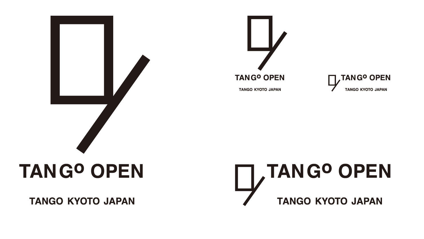
The square is a symbol representing cloth and the “O” of “OPEN”. It is also a figurative door to the rest of the world. This particular square was constructed based on both the Egyptian-born golden ratio as well as the silver ratio. The latter is well known amongst the Japanese, so this provides us with two symbols combined into one: a symbol of the world (golden ratio), and a symbol of Japan (silver ratio). In addition, next to the square lies a slash. On top of the slash having the meaning of “partition”, this one is aimed upwards and is depicted in a positive light. Furthermore, in accordance with the character “旦”, if one tilts the logo at an angle it will resemble a sunrise.
We tried our best to design a simple yet rememberable logo. However, it was also necessary to create something original to ensure patentability. Keeping both of these goals in mind, we arrived at our current design. We expect that this type of open-ended composition will allow us to use the logo in a wide variety of situations, perhaps even unrelated to textiling. For example, it may be possible to market the food, lodging, and pastimes of Tango under the「TANGO OPEN」brand.
_The Reasoning behind “TAN G ° OPEN”
While being a well-balanced expression that pays homage to the “Tango” region, it tactfully conceals the positive catchphrase, “GO OPEN”.
It should be apparent that this is a combination of our region’s name and “GO OPEN” when the expression is paired with “TANGO KYOTO JAPAN”. However, here lies an important feature: there is a small space between “TAN” and “G ° ”. If we made the space too large, then the phrase would cease to be read smoothly as one word. It would also start to lack regional appeal. Furthermore, “tan” is a verb that already exists in English, so speakers of that language might imagine “drying animal hide” or “spanking”. Thanks to this faint space between “TAN” and “G ° ”, the trademarking process becomes smoother, and we can convey that “TANGO” and “GO OPEN” are two sides of the same coin.